Tuesday, January 18, 2011
Wednesday, December 1, 2010
Saturday, November 27, 2010
Roses Design Awards - Sound and Silence coalition
The Brief - Create and promote an unlikely coalition - after all opposites attract!
The cd’s are to promote the coalition of sound and silence.The concept is that the auditory cortex can create sound when we are visually watching something in silence or having a mental picture. The brain will always try and create sound to match what we are seeing even in silence.
Each cd cover has a graphic diagram of this concept and each include ear plugs to demonstrate the idea of silence while set in a cd cover which illustrates the idea of sound. Each cd cover illustrates different pitches as sound is not monotone but vast in its breadth of tone and pitch. Each one has different colours and graphics to express the style of the pitch.
Low Pitch - soft colours and smooth graphics.
Mid Pitch - slightly stronger colours and harder graphics.
High Pitch - Bold and bright colours and harsh graphics.
Friday, November 26, 2010
Bloomberg - D&AD Design Award project
This project was for a D&AD design award brief for Bloomberg. It was to 'Capture the essence, energy and varied perspectives of humanity in a series of photographs that are sympathetic to Bloomberg's new corporate identity. I decided to create a 'Bloomberg world' in which corporates the four concepts - Moving Mountains, Running the race, New heights and World's megaphone all of which are to represent who Bloomberg are.
Hello...I'm H2O
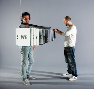
This is another project for my course. I created an interactive information graphics piece. I wanted to create a product which would appriciate what H20 really is. I decided to make H20 into a character and illustrating those different sides of the character with interesting random information about solid, liquid and gas. I displayed this information on ten different slot cards to illustrate the different sides of the character! You can build it up in any way you like being able to walk round it looking at all the different information.
Subscribe to:
Comments (Atom)


